

Rebranding of a Bulgarian egg farm
Angelov is the largest Bulgarian farm for the production of eggs from free-range hens, which has imposed their consumption on the domestic market. A distinctive feature of these eggs is their white color.
When the farm contacted us in 2018 to re-design their brand, we were very pleasantly surprised. We were amazed how an established brand, operating in dozens of European markets, with a good reputation and partnerships, has not sooner paid attention to the overall vision of its logo – dark, outdated and non-communicating the brand. In other words, it looked like this:
The management’s vision for the future of the brand was extremely colorful, bright and meaningful, inspired by the leaders in the sector in Europe and the world. The client wanted us to keep the hen, and we insisted on further developing the brand idea with a slogan. In other words, their new logo already looked like this:
![]()
With a new brand identity and self-confidence, Angelov’s farm decided to try to impose two innovative products for the Bulgarian market. For this purpose we prepared packages’ mockups
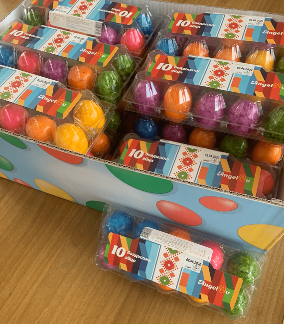
So Easter knocked on our door earlier. We received a brief for making packaging for painted eggs. It sounds incredible, but so far, Bulgarian painted eggs in Bulgaria have not been produced and distributed in the commercial network. We put on our rabbit ears and sank into a brainstorm.
We found inspiration in the Bulgarian folk traditions and costumes, and as a main element we used traditional embroidery “shevitza”- a great Bulgarian art. Our insight was also tied to the fact that we wanted to convey the idea of the brand in the best way in their new product.
Mockup:
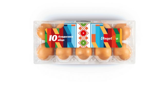
Package:
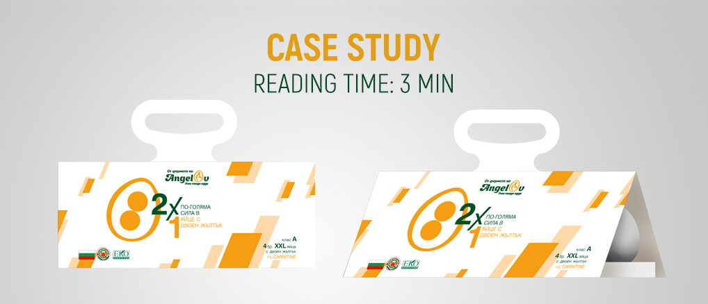
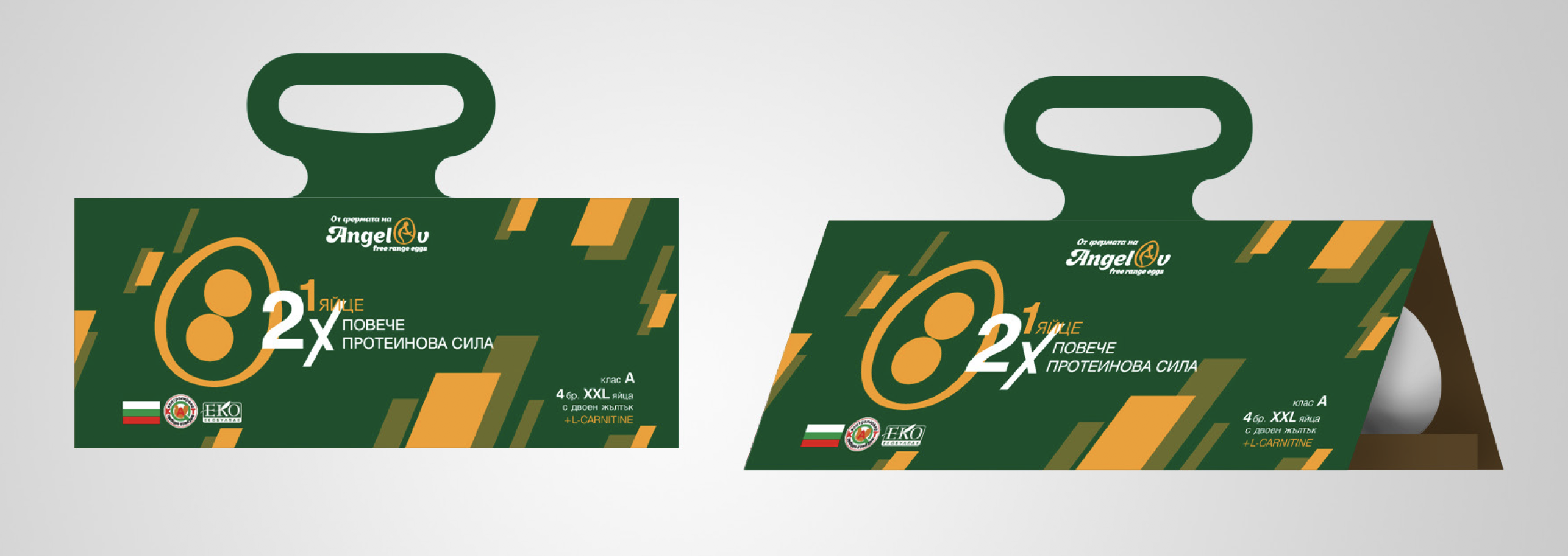
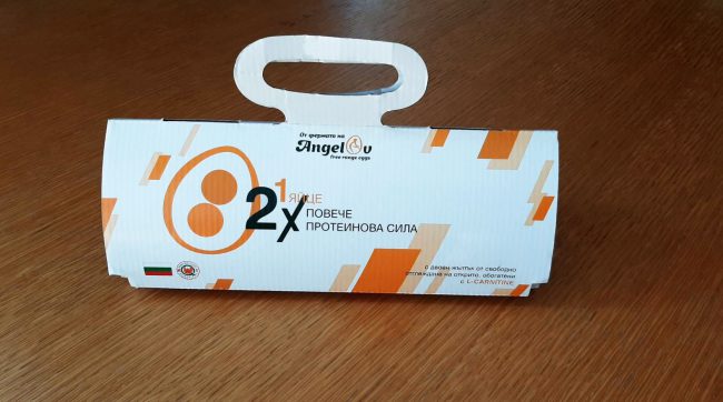
But Angelov’s farm decided to be even bolder and to introduce to the market another product without analogue in the high price range – eggs size XL-XXL with double yolk and enriched with L-carnitine. Target were consumers with an interest in healthy eating, sports and fitness, keto, etc. Here the client also needed a new, completely different package to show the size of the eggs. This led to the concept of “Twice as much protein in one egg” with an open triangular box for 4 eggs, from which you can see them.
Mockups:
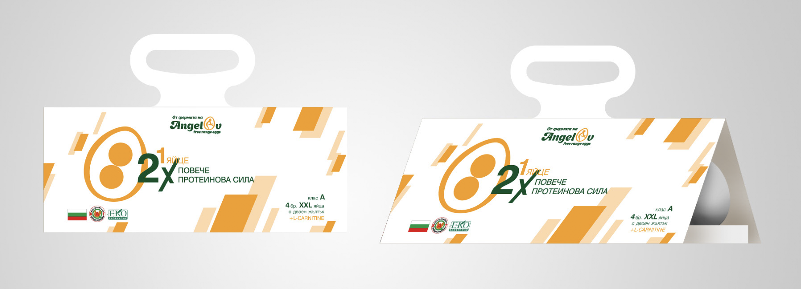
Package:
Angelov’s farm doesn’t stop there. We are preparing the most creative and squeaky debut of the brand on social media. Follow the farm’s Facebook & Instagram channels so you don’t miss the creative egg shows.
Ahhh, and don’t forget to follow us, both on the blog and on Facebook and Instagram.